|
Water Resources Forecast Verification Help
To produce a consistent dataset for developing water resources forecast verification metrics, retrospective forecasts (reforecasts) of streamflow at 42 water supply forecast locations were generated with the Hydrologic Ensemble Forecast Service (HEFS) for the 1985-2010 period at 12Z each day. Inputs to the HEFS reforecasts included raw precipitation and temperature forecasts from the NCEP operational Global Ensemble Forecast System (GEFS) reforecasts for days 1 to 15 and from climatology for days 16 to 365. Each streamflow reforecast was sampled to include 60 ensemble members with lead times out to 365 days in daily increments. The streamflow reforecasts at each location were aggregated to two accumulation periods for verification: seasonal (April-July, AJ) and water year (October-September, WY) accumulated volumes in thousand acre-feet (KAF). Reforecasts produced during the accumulation period were constructed by combining observed totals to date with the residual forecast for the remaining forecast period, similar to how forecasts issued in real-time operations are compounded. To maintain consistency with the historical GEFS input data, only streamflow observations for the 1985-2010 period were used to verify forecasts. Five verification products were produced to assess forecast skill (correlation), scatter, bias (% error) and reliability, in both the aggregate case and enumerated for each issuance. In particular, the verification tabs available include:
In all of the plots, hovering over individual dots, lines and legends provides cursor readout of errors, dates, years or variables of interest. Zooming is also supported on sections of the graphs by outlining a rectangular area with the mouse or pointing device. Sub-plots also can be highlighted or called out by double clicking.
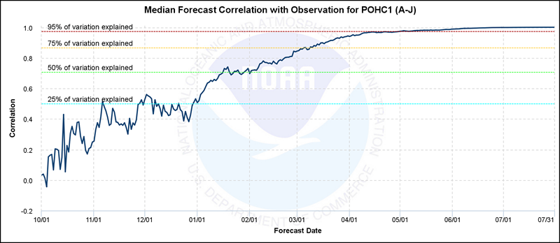
"When does the forecast model obtain appreciable skill?" The correlation plot shows the characteristic seasonal change in the correlation coefficient between the median forecast and observation at a given forecast location. The correlation is calculated based on the 25 years of historical forecast and observed data at each day of the year. Forecast skill increases over the course of the year as more information is known on the accumulated precipitation and snow over the basin. The horizontal dashed colored lines illustrate when specified levels of the total variation are explained by the forecast model. Shown below is a sample Correlation Plot for April-July seasonal accumulation for the Merced River at Pohono Bridge (id=POHC1). Note that approximately 50% of the observed variation is explained by the forecast model by the middle of January, as shown by the horizontal dashed green line. Similarly, 95% of the total variation is accounted for by the model by mid-April (dashed red line). Also note that hovering over the dark blue correlation line provides a cursor readout of the correlation (r) and explained variation fraction (r2) by date. Zooming is supported on sections of the graph by highlighting a horizontal portion of the graph with the mouse or pointing device.
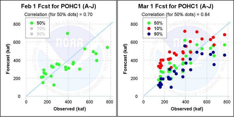
“How does the scatter of forecasts vs observations vary by month of issuance?” Scatter plots are provided to show the relationship between the forecast and the observed runoff volumes for Seasonal April-July accumulations or complete October-September Water Year totals for each month beginning in October. The relationships and correlations progressively get better over the course of the year as more information about the water year is revealed. Runoff volumes are shown in 1000 acre-feet (KAF). Scatter plots show data from 1985-2010. Shown below are representative scatter plots (example of February and March) for first of the month forecasts from October through July for the seasonal (A-J) runoff accumulation on the Merced River at Pohono Bridge. By default, only the 50% exceedance (or median) forecasts are shown on the plot with green dots, but the 10% (red) and 90% (blue) exceedance forecasts representing the so-called reasonable maximum and minimum forecasts, respectively, can be added or replaced on the plots by clicking on the items in the plot legend. Individual monthly plots can be called out and expanded by double clicking, as shown below for the March 1 forecast, where all three exceedance levels are also activated. Hovering over individual dots provides cursor readout of the forecast, observation and year. Zooming is also supported on sections of the graph by outlining a rectangular area with the mouse or pointing device. Ideally, observations as represented by the light blue 1:1 diagonal line would only exceed or be above the 10% exceedance forecast dot in ten percent of the cases (see 1995 as an example) and also below the 90% exceedance forecasts ten percent of the time (1993 as an example), with 80 percent of the cases falling between these levels. Additional representation of the forecast reliability can also be found under the Reliability Histograms tab.
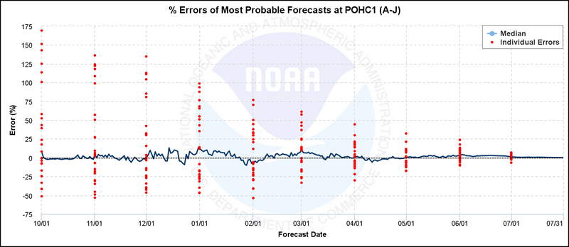
“Are the most probable forecasts biased? How do the errors vary?” This plot provides information on forecast bias by showing the median (continuous blue line) and range of forecast percent errors (red dots) in the most probable 50% exceedance forecast produced at different times of the year for each historical water year over the 1985-2010 evaluation period. The percent error is calculated as the difference between the most probable forecast and the observation divided by the observation. The observation can be either the Seasonal April-July (A-J) accumulation or the complete October-September Water Year (WY) total. Zooming is supported on sections of the graph by outlining a rectangular area with the mouse or pointing device. Shown below is the Percent Error plot for the Merced River at Pohono Bridge forecast point for the seasonal April-July accumulation period. Note that percent errors for these 50% exceedance forecasts vary widely from year to year, particularly early in the forecast season. On the December 1 issuance date, for instance, percent errors ranged from a low of -47% in 2005 to a high of +137% in 2006 over the 25 year period of evaluation, though the median percent error of the 25 most probable forecasts made for each year on this date was near zero at +0.3% (blue line). Additional representations of year to year performance can also be found under the Box Plots tab. Hovering over individual dots and lines provides cursor readout of the %errors, dates and forecast year. Zooming is also supported on sections of the graph by outlining a rectangular area with the mouse or pointing device.
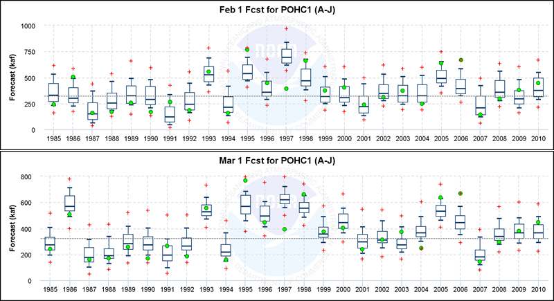
“How did yearly observations compare with each of the monthly forecasts?” These graphics use box and whisker plots to show probabilistic forecasts and observations for each year in the evaluation period of 1985-2010 at first of month issuance times. The box plots use a central mark on each box to represent the median (50% exceedance) forecast; the tops and bottoms of the boxes denote the 25% and 75% exceedance forecasts, respectively; the whiskers (horizontal lines) above and below the box denote the 10% and 90% exceedance forecasts, respectively; and the red crosses illustrate the absolute maximum and minimum ensemble member forecasts for that issuance. Green dots are used to represent the observations, either seasonal April-July (A-J) accumulations or October-September Water Year (WY) totals. The light dashed black line shows the long-term mean of the observations that is commonly used to develop percent of normal characterizations of the forecasts. Zooming is supported on sections of the graph by highlighting a horizontal portion of the graph with the mouse or pointing device. Shown below are box plots (example of February and March) for the Merced River at Pohono Bridge for the April-July (A-J) accumulation. Among all of the monthly issuances, look at the sub-plot for the March 1 forecasts. The spread in the probabilistic forecasts varies sharply from October to July and March often serves as a good benchmark, as the skill is strong while there is still discernible spread in the interquartile range (25-75% exceedance levels) illustrated by the height of the forecast box. Ideally, half of all yearly observations (green dots) should fall within the boxes, while 80% of years should fall between the whiskers. As is the case here, the forecast models can often be under dispersive, with less than 80% of observations within the whiskers. This outcome can also be seen under the Reliability Histograms verification tab.
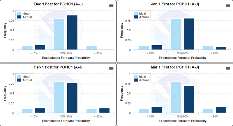
“Are the probabilistic forecasts reliable?” The plots in this section depict the reliability of the 10 and 90% exceedance forecast probabilities and the resulting three ranges delineated by these levels. Ideally and by definition, 80% of observations should fall within the middle range or category between the 10% and 90% forecast levels, with 10% of the observations above the 10% exceedance (or reasonable maximum) forecast and 10% below the 90% exceedance (or reasonable minimum) forecast level. In these graphics, the ideal frequency is illustrated by the light blue vertical bars and the actual or observed frequency is shown with the dark blue bars. An under-dispersive forecast model in which less than 80% of observations fall within the middle category is not uncommon, particularly later in the spring and summer months when comparatively little uncertainty remains in the future weather information and the uncertainty is attributed more to estimates of the watershed soil moisture and snow conditions, errors that are not explicitly addressed by the forecast system at this time. Fortunately, the magnitudes and ranges of the errors and forecasts late in the season are greatly compressed. Shown below are the first of month reliability histograms (example December, January, February, and March) for the Merced River at Pohono Bridge for the April-July (A-J) accumulation period. Look at the March plot, where the underdispersion of the forecast model is illustrated by the 15% (rather than 10%) count of observations in each of the tails, and the consequent under representation in the middle interdecile range. Alternative and supportive representations of this same reliability information can also be viewed in the Box Plots tab and in the aggregate with the Scatter Plots tab.
|
|||||||||||||||||||||||||||