|
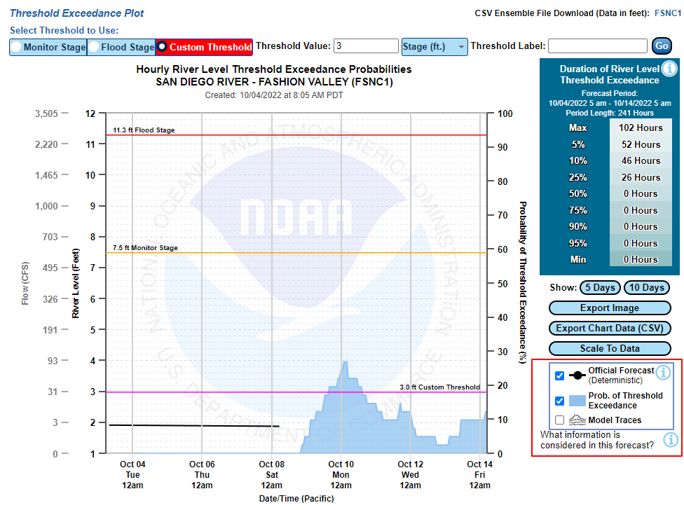
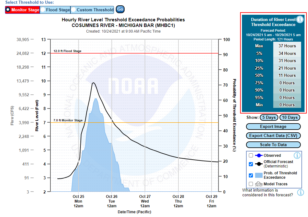
HEFS Threshold Graphic Sections: Export Options | Legend Displays | Excedance Table | Archive Utility The threshold plot displays both the short-term deterministic streamflow forecast along with probability exceedance information related to a user-specified threshold. It can be accessed for a given location by clicking on the "Threshold Plot" button above the graphic display area.
The shaded blue area (seen in the examples below) provides the probability of exceeding the user-specified threshold for each hour. The probabilities are provided on the secondary (right) Y-axis. The plot also displays the deterministic stage/flow forecast, and the values for that time series are displayed on the primary (left) Y-axis. These graphics are interactive, and contain quite a few features. This document will go over all of them. Time series and graphic export options Below are two ways to download data from the plot. The red box in the upper right provides a link to raw ensemble streamflow time series in csv format when the 5-character ID is clicked. The red box in the lower right of the graphic highlights two download options related to what is actively displayed in the graphic. You can download an image of the current information displayed in the graphic or you can download all the time series that are currently displayed in the graphic.
Legend Displays The legend in the bottom right corner is interactive. The user can turn features on and off by checking the boxes associated with each feature. The ensemble traces are turned off by default, and the deterministic forecast and probability bands are turned on. Notice there is also an information button in the legend (
Exceedance Table The exceedance table in the upper right-hand corner provides a list of hours for which the user-specified threshold will be exceeded, and their associated probability of being exceeded for the entire forecast window that is actively being viewed in the graphic. As you zoom in/out of the plot, the duration hours and the associated probabilities in this table will dynamically change.
The user can select monitor or flood stage as the threshold, or a custom threshold. When selecting a custom threshold, a box for entering a stage/flow value and a label will appear:
Archive Utility Below the interactive graphic there is a Verification/Historical Plots section where a user can select a forecast date and time. When the user selects a date and hits the "Fetch" button, the interactive graphic will update with the information from that date. The legend will also have an observed option for comparison to the forecast information.
Above the interactive graphic will be a yellow banner indicating that this current graphic is not the latest forecast, and provides a link back to the current forecast.
|


 ). If you hover over the icon, additional text will be displayed related to the feature it is next to. In the legend, this feature is the deterministic forecast. So hovering over the information button will give a detailed description of what the deterministic forecast is, and how it differs from the probabilistic forecast information.