|
HEFS Build Your Own Interface - Making Selections and Interpreting Results The HEFS Build Your Own interface provides tremendous flexibility in deriving products and information from the available ensemble streamflow traces. It is very important that the selections and information be well understood, as potential for misinterpretation can be quite high. A very general overview of the HEFS process is provided in General Ensemble Theory for Streamflow Forecasts. Please also see HEFS - A Few Words of Caution to review the current limitations of HEFS as implemented at the CNRFC. The user interface allows for custom product and information generation based on the following selections:
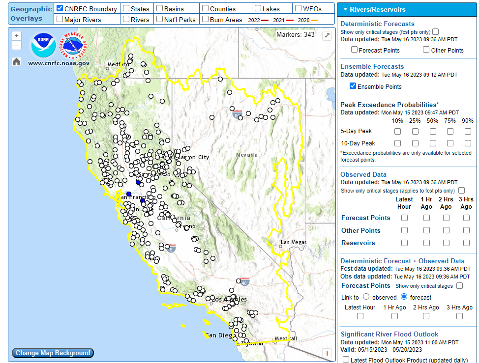
1. Select an HEFS Trace Location The selection of the HEFS location is done by turning on the ensemble points on the CNRFC front page map:
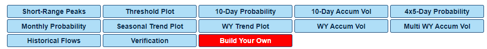
Then, the user can click on the white dot of their choice. This will bring up location-specific HEFS graphics available for the user-selected point. When the “Build Your Own” blue button is selected, the interface will be brought up:
2. Select an Interval The interval is selected by clicking on the “Interval” dropdown menu. The interval options available are day, week, month, and entire period. 3. Select a Value Type The value type is selected by clicking on the “Value Type” dropdown menu to the right of the “Interval” menu. The 4 types are mean flow, minimum flow, maximum flow, and volume. The following table explains the product for each interval and value type combination:
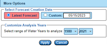
4. Select Start and End Dates The start date defaults to the current forecast date. The end date defaults to a full year out beyond the current forecast date. These dates can be changed by the user by clicking in the “Start Date” and “End Date” boxes. The system will not allow you to select a date in the past when using the most recent forecast issuance. 5. Select Other User Options There are other options a user can specify under the “More Options” button.
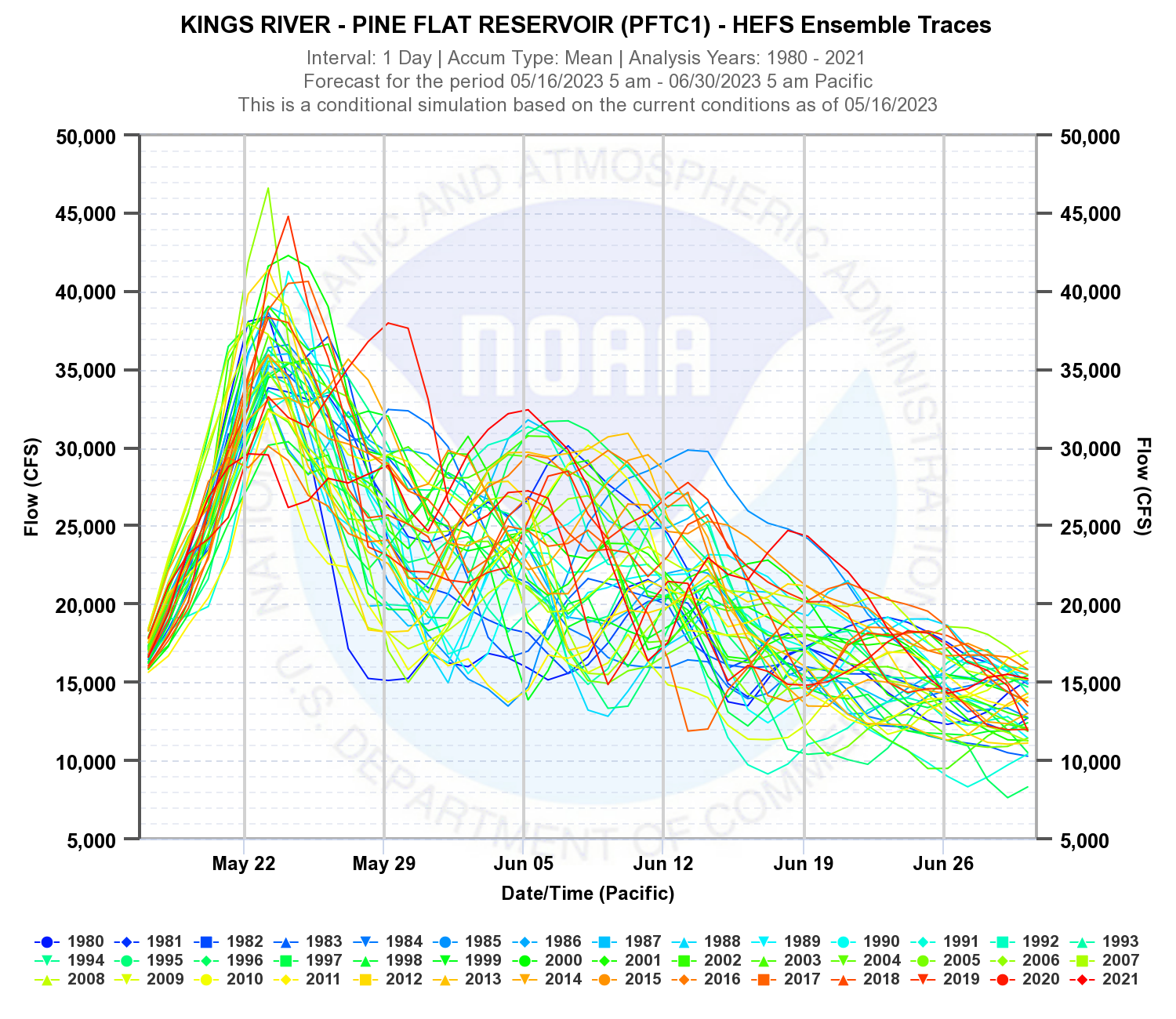
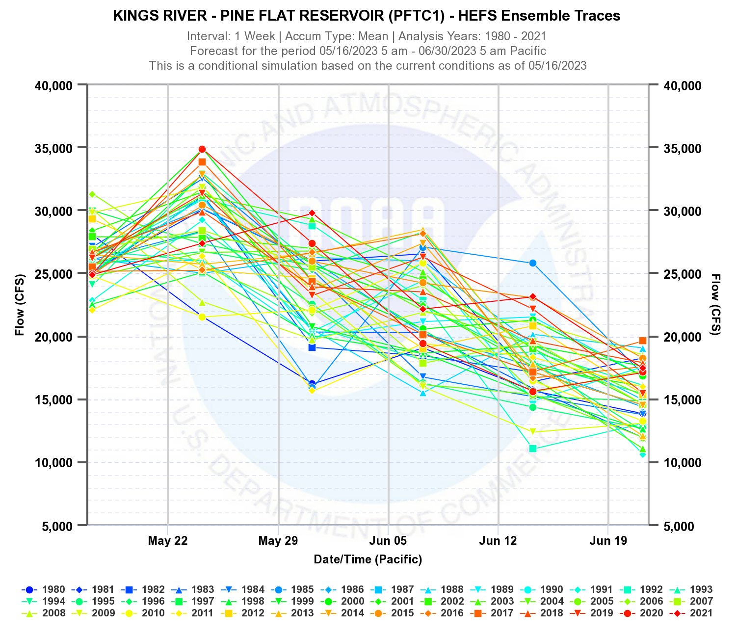
When this button is clicked, the user can define the traces of interest under the “Customize Analysis Years” header. The default is to use all traces available in the HEFS output. However, if a user would like to constrain this range to a tighter climatological period, they can do so. The other option is to select an older forecast issuance date. As noted in step 4 above, the default is to use the current forecast issuance date, and no start date can be selected prior to the current forecast date. However, if the “Custom” option is selected, the user can select an older forecast, and the start date will then be changed to the user-selected forecast creation date. 6. Select a Plot Type or Table a. The first plot type is “Traces”. Traces will show the streamflow time series for each climatological year over the selected analysis period. Data will be aggregated for the interval selected. For example, if the user selects the Interval = Day and the Value Type = Mean, you will get the mean daily flows for each day of the analysis period.
The traces plot can be pretty busy. Hovering over a given trace will indicate the year label along with the associated flow value that the mouse is hovering over. The individual traces can also be turned on and off by the user by clicking on the labels in the legend. All traces can also be turned on or off. If you select Mean and Week, then you will get the average daily flow for the 7-day periods beginning on the date selected.
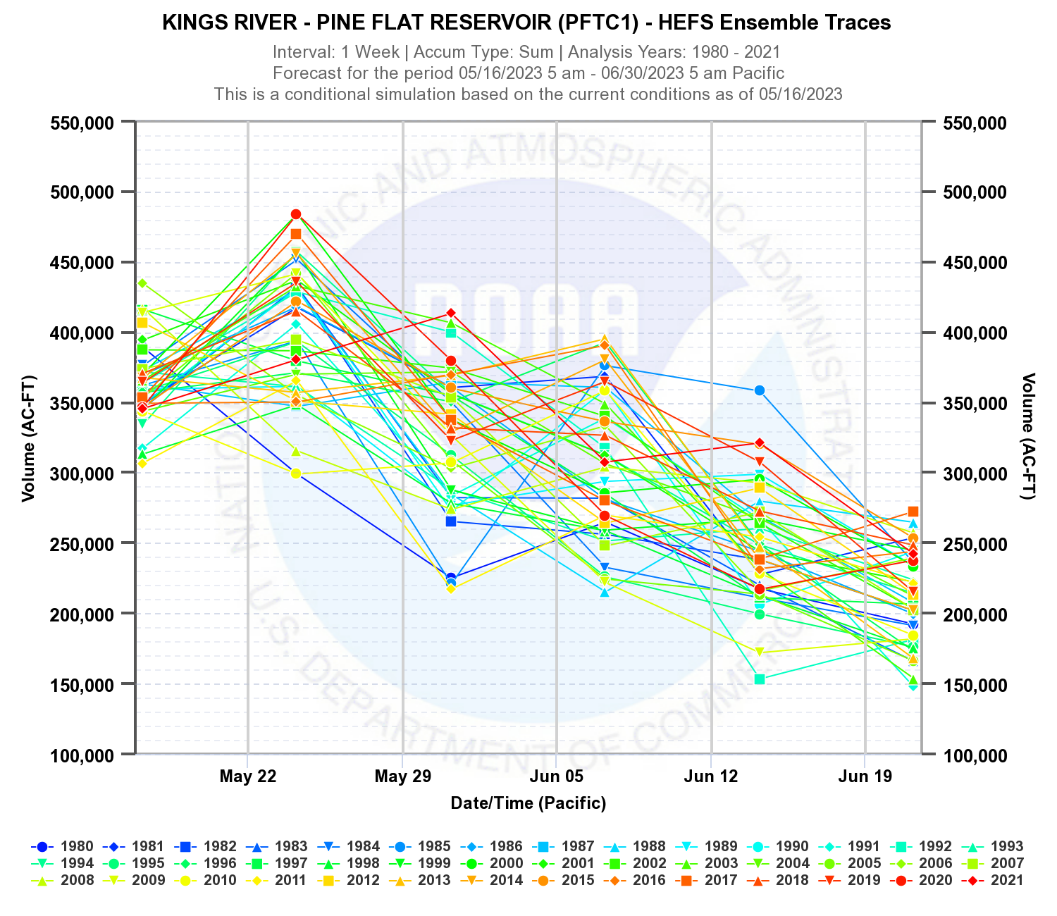
If you select Week interval with Volume value type,you’ll get the same plot as above, but with volumetric acre-feet units instead of flow in cfs.
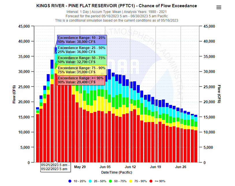
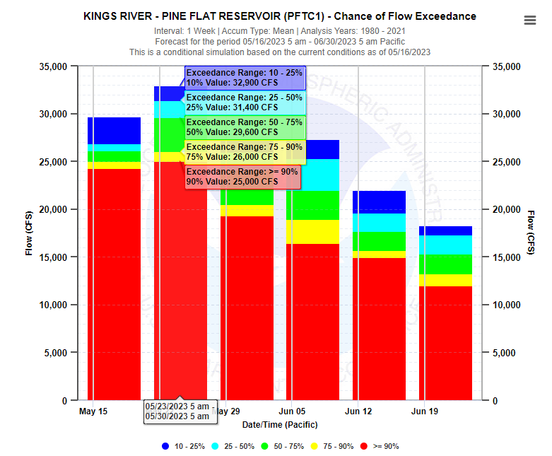
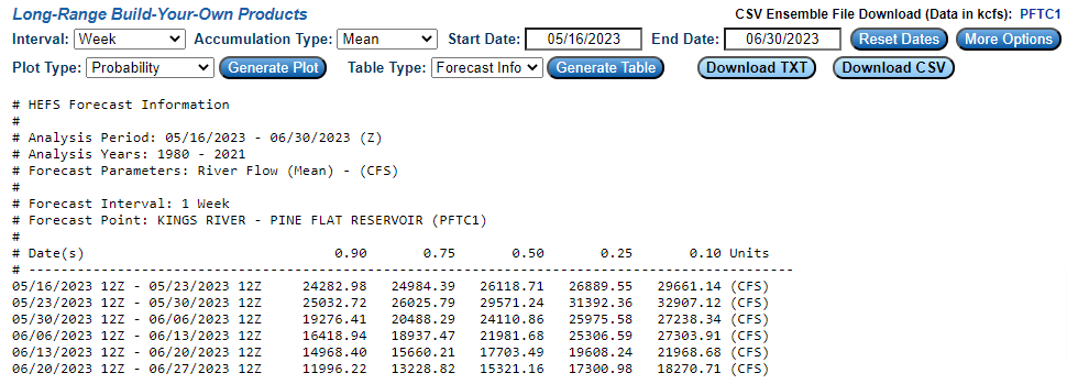
b. If you select the Probability plot type, the graphics will display the statistical probability distribution of the traces shown above. Instead of showing the individual time series, the time series are collected, analyzed, and fit with a distribution. From this distribution, ranges of exceedance probabilities are sampled and displayed. Currently, the CNRFC is fitting an empirical distribution for all analyses on this website.
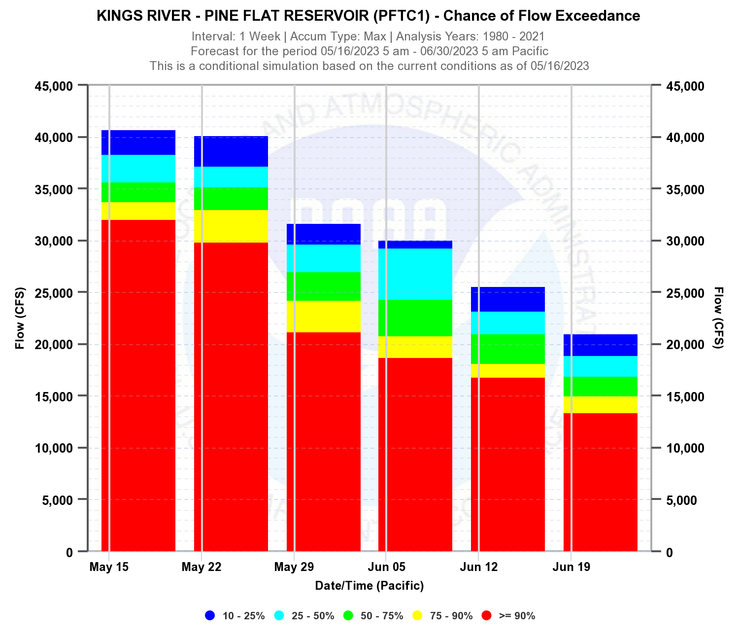
If you select the Mean and Week options along with the probability plot type, you’ll get the probability distribution for each 7-day period, starting on the beginning date in 5 colored regions. The colored regions show the range of exceedance probability which can be resolved by date and flow level. From below, there is a 90% chance that the average flow during the week starting on 05/23 will exceed 25,000 cfs.
If you select Maximum and Week options, you’ll get the probability distribution for maximum mean daily discharge within each 7-day period starting on the beginning date. The colored regions show the range of exceedance probability which can be resolved by date and flow level.
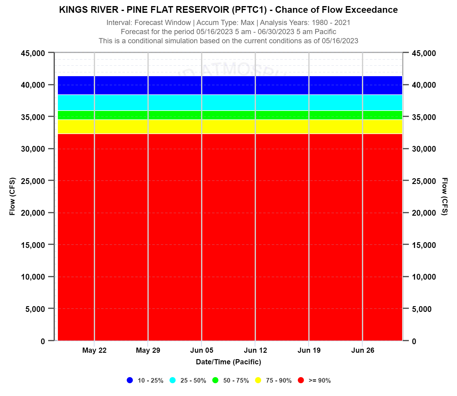
If you select Maximum and the Entire Period, you’ll get the probability distribution for maximum mean daily discharge for the entire period selected. Since the maximum flow is allowed to take place on any day, it is naturally higher. The colored regions show the range of exceedance probability by and flow level. Here the Mean, Maximum, and Minimum have very different meanings.
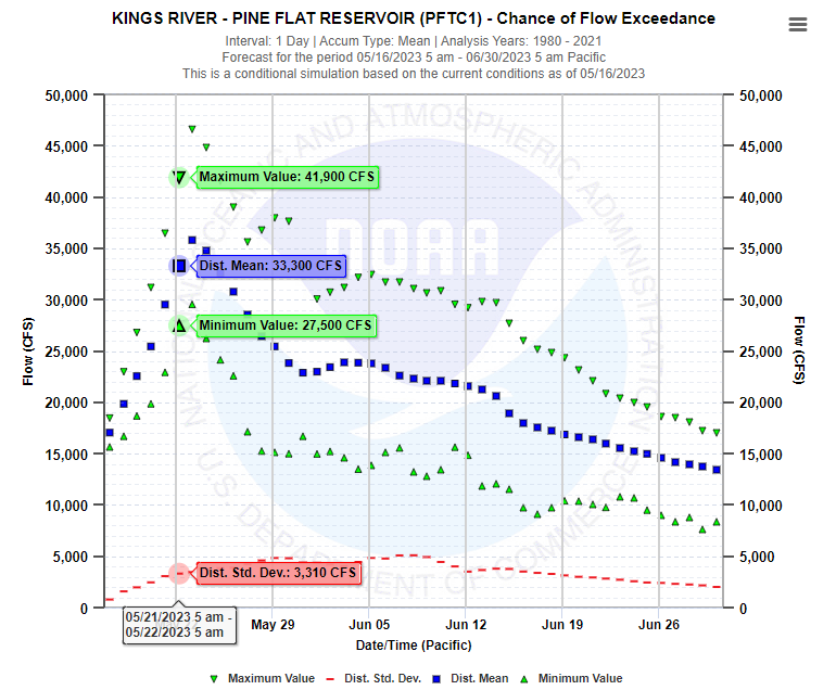
c. The expected value plot simply shows the probability information in a different way. Inferences related to the selection of Mean, Minimum, Maximum, and Summation can be taken from the examples related to the plots. Aside from looking different, the most important distinction is that there is no assumption or fitting of a theoretical probability distribution. If you select Mean and Daily, you will get minimum, maximum, mean, and standard deviation values for each day in the analysis period.
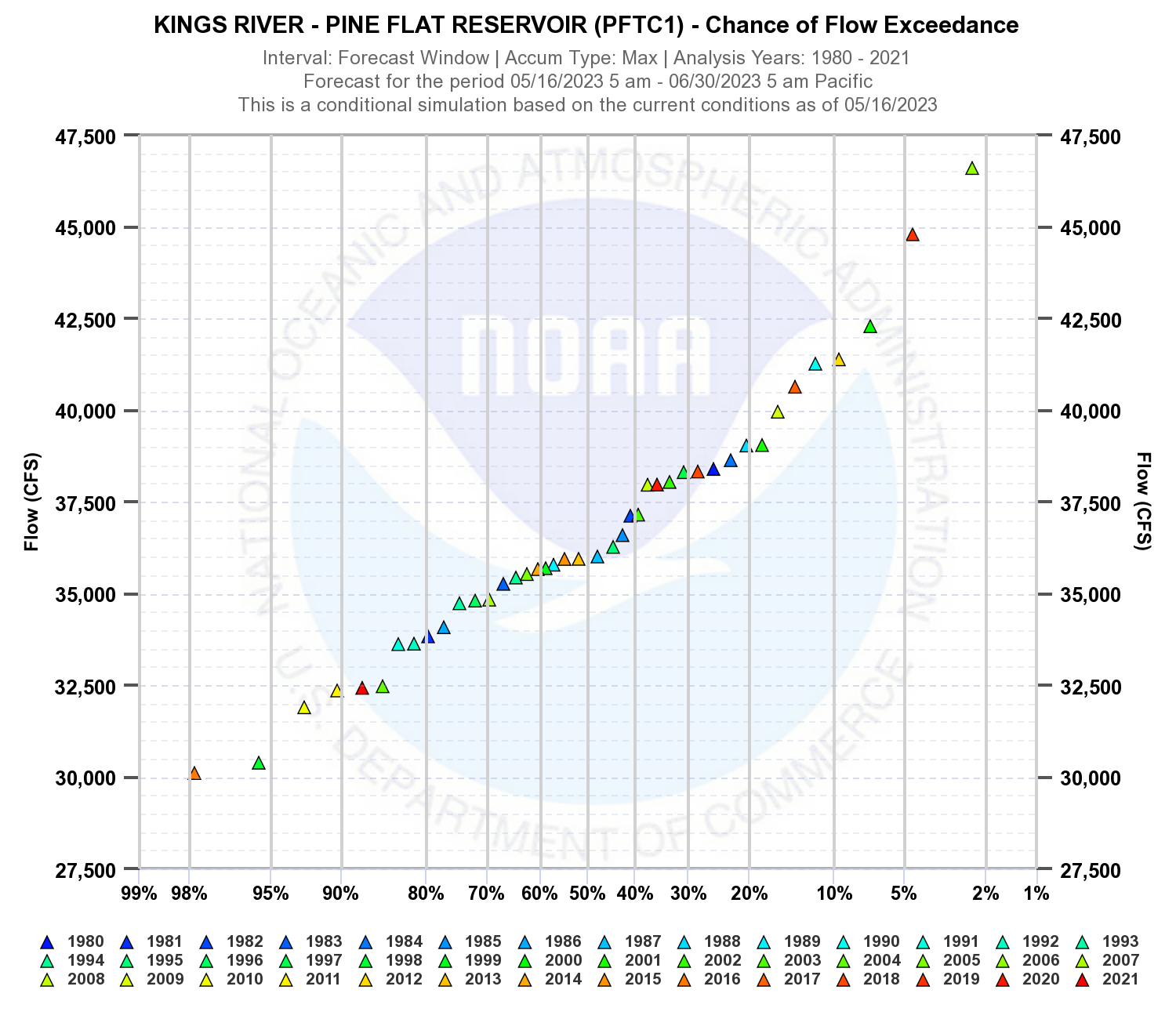
d. The plot exceedance display option plots the exceedance probability (%) against the log of flow. The CNRFC assumes empirical distribution for this plot type, You can see the percent chance a given flow will be exceeded during the user-specified analysis window. Below is an example if Maximum and Entire Period interval are the selected interval and value type options. The start date for this plot is May 16, and the end date is June 30. So this plot is showing what the % chance of exceedance will be for a given maximum daily flow within the May 16 to June 30 time window. If the Weekly interval is selected with Maximum, the plot would show the % chance of exceedance for a given maximum daily flow over the first week lead time starting on May 16. If the interval is changed from Weekly to Daily and the Value Type is kept at Maximum, the plot will depict the exceedance probability distribution for the range of daily flow values over the first day lead time starting on May 16.
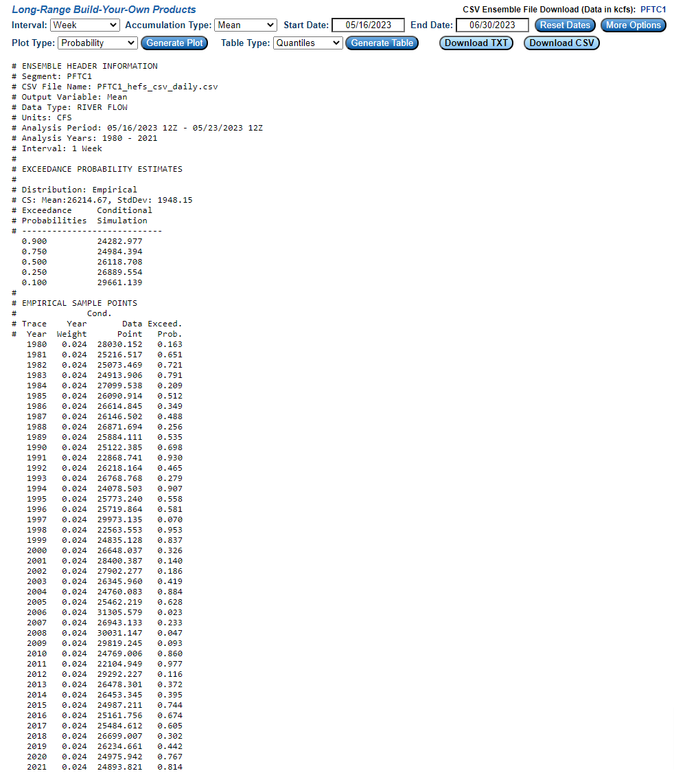
e. If tabular output is desired rather than graphical, the user can select two options under the “Table Type” dropdown: 1) Forecast Info, and 2) Quantiles. The tabular data can also be obtained from the cursor readout capability from the graphs, but if you’d like all of the numbers consolidated into a single table, the tabular output is a good option.
f. Selecting the Quantiles option brings up the same summary statistics, but also the exceedance probability for each trace year and the corresponding value. The data in the table is valid for the first valid interval in the selected period.
7. Export Options The graphics and text data can be exported in a number of ways and formats. The tabular data can be exported as a text file or a csv file by clicking the buttons highlighted in red below:
If you want to export the raw ensemble trace information, you can click on the 5 character location ID in the upper right corner of the menu:
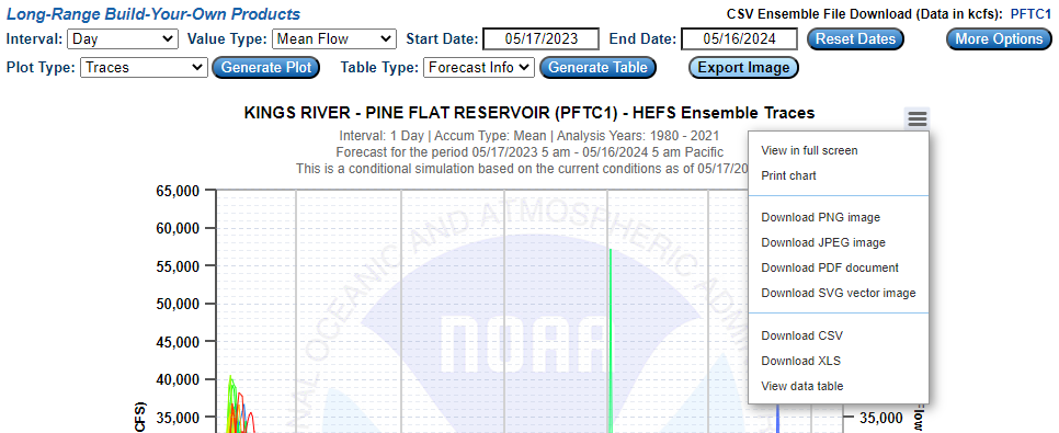
The graphical data can be exported by clicking on the Export Image button highlighted in red below when an image is being displayed by the interface:
You can also use the “hamburger” menu within the plot to export image data:
|
||||||||||||||||||||||||||||||||||||||||||||||||