|
Short-Range Peak Graphic Sections: Export Options | Legend Displays | Excedance Table | Archive Utility | Custom Thresholds The short-range peak graphics display both the short-term deterministic streamflow forecast along with probability information from the HEFS ensemble streamflow forecasts. It is the default plot that is displayed when an ensemble forecast location is selected from the map on the CNRFC homepage. It can also be accessed for a given location by clicking on the top left button above where graphics are displayed.
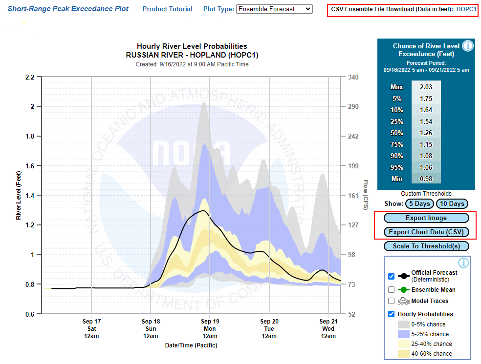
These graphics are interactive and contain quite a few features. This document will go over all of them. Time series and graphic export options Below are two ways to download data from the plot. The red box in the upper right provides a link to raw ensemble streamflow time series in csv format when the 5-character ID is clicked. The red box in the lower right of the graphic highlights two download options related to what is actively displayed in the graphic. You can download an image of the current information displayed in the graphic or you can download all the time series that are currently displayed in the graphic.
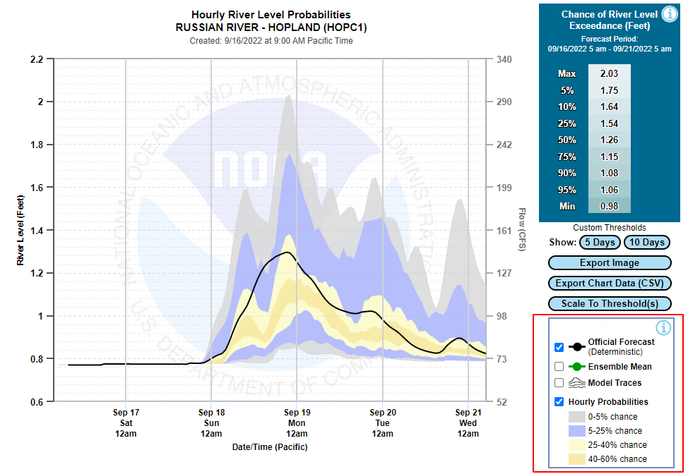
Legend Displays The legend in the bottom right corner is interactive. The user can turn features on and off by checking the boxes associated with each feature. The ensemble traces and the mean of all the traces are turned off by default, and the deterministic forecast and probability bands are turned on. Notice there is also an information button in the legend (
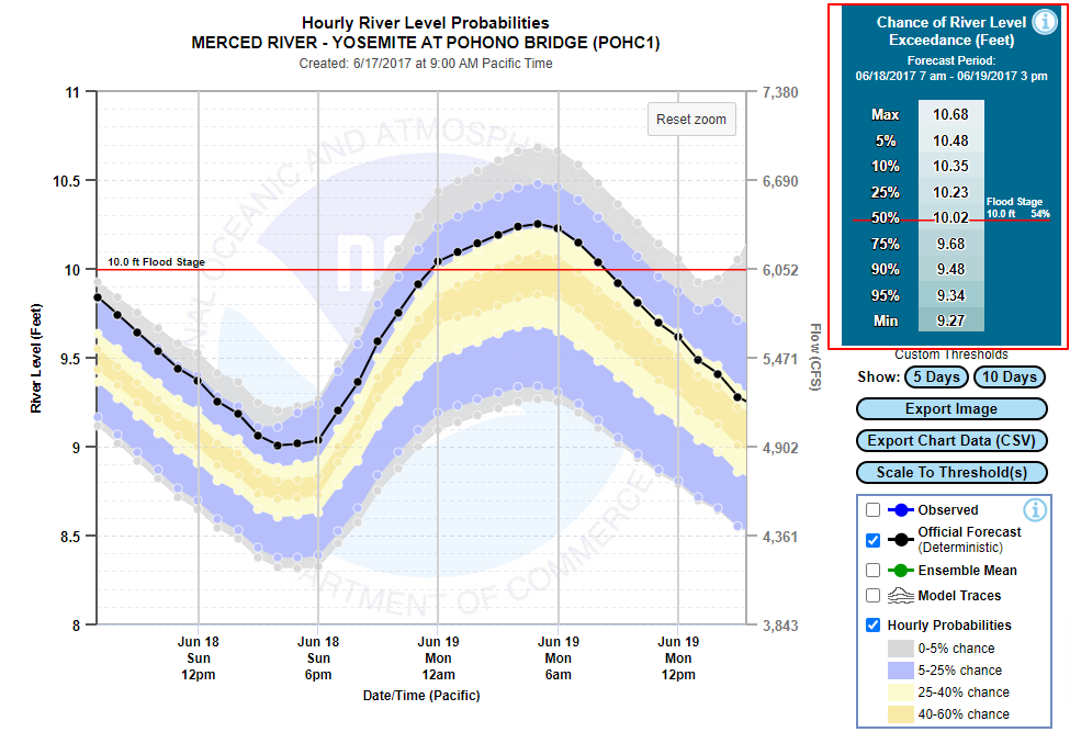
The hourly probabilities legend describes the bands of uncertainty shown on the plot. These bands indicate how the stage/flow probabilities are changing on an hourly basis. As you hover over the graphic, you will see cursor readouts for the upper and lower edges of each band (see example below). For this example, there are a number of values shown. The 40%/60% gives two values. The first value is indicating that there is a 40% that the river will equal or exceed that level for that particular hour. The second value is indicating that there is a 60% that the river will equal or exceed that level for that particular hour.
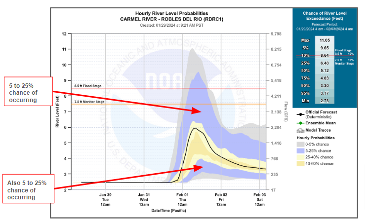
The light yellow, purple, and gray areas each have two distinct bands. The purple region, for example, has a lower region that has a 5% to 25% of the river level (see below). Both areas describe the region where there is between a 5% and 25% chance of where the river level could be. The lower purple area can also be interpreted as the region where there is a 75% to 95% chance of being exceeded.
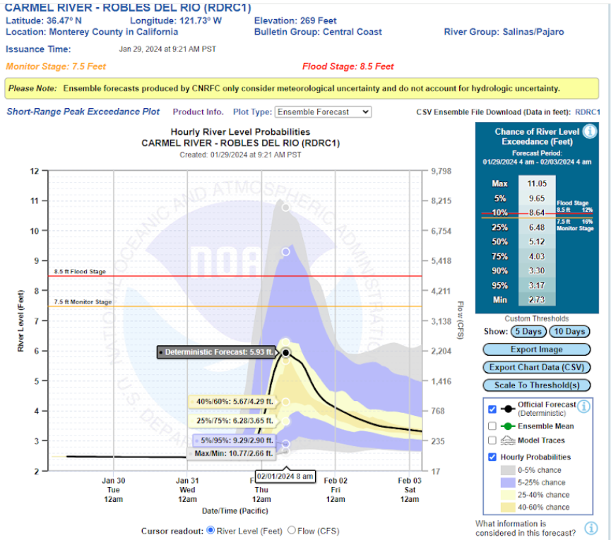
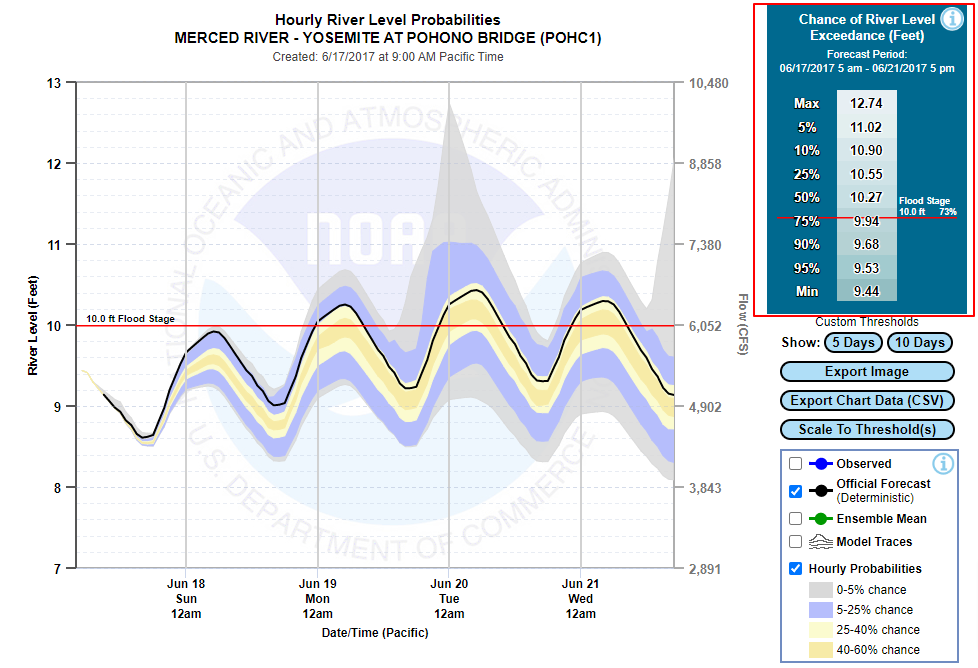
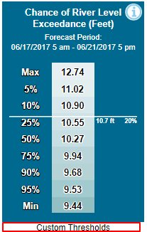
If the user wants to know what the probability is of exceeding a certain level for the entire viewing window (not just for a particular hour), the exceedance table is the best tool for that (described in the next section). Exceedance Table The exceedance table in the upper right-hand corner provides a list of river stages/flows and their associated probability of being exceeded within the selected forecast window. If the forecast location has an established monitor and/or flood level, the probability exceedance will be highlighted by a line in the table with the exceedance probability labeled - a red line for flood stage, and an orange line for monitor stage. In the example below, the zoom window is 5 days, and the associated probability of exceedance for flood stage is 73% in the table. The range of stages in the table span from 9.44 to 12.74 feet.
When zooming into a tighter time window, you will see the values in the table change dynamically. When we zoom into a window of roughly a day in the example below, you can see the flood stage exceedance changed from 73% to 54%, and the range of stages changes in the table are now 10.68 to 9.27 feet (see image below).
Archive Utility Below the interactive graphic there is a Verification/Historical Plots section where a user can select a forecast date and time. When the user selects a date and hits the "Fetch" button, the interactive graphic will update with the information from that date. The legend will also have an observed option for comparison to the forecast information.
Above the interactive graphic will be a yellow banner indicating that this current graphic is not the latest forecast, and provides a link back to the current forecast.
Custom Thresholds The user also has the capability to enter thresholds other than monitor and flood stage. When adding this information, the threshold will show up both in the plot and the summary exceedance table. The user can enter the threshold (either stage or flow) by clicking the link below the Chance of River Level Exceedance (or Chance of Flow Exceedance) table:
|
 ). If you hover over the icon, additional text will be displayed related to the feature it is next to. In the legend, this feature is the deterministic forecast. So hovering over the information button will give a detailed description of what the deterministic forecast is and how it differs from the probabilistic forecast information.